For this project I chose to take a photograph of a small candle outside and create a 3D model of it and match it to my photograph.
Analyzing the Reference
When in a brighter area, more detail of the texture can be seen such as the small splotches of blue and the subtle scratches on the surface. Also, the candle appears to be slightly reflective and has high specular highlights along the rim and the sides. Most of these details are less apparent in darker areas. This texutre also has a fairly high diffusion as seen in a photo below.
Because of the direct sunlight, the shadow is fairly linear and does not widen out as if it were being lit by a spotlight. The is also fairly sharp around the edges, a little transparent, and has a blue hue to it. This blue hue is most present on a bright colored floor.
Since the candle is slightly reflective, the reflections will change based on its surroundings. The color of the specular streaks on the side will be a color similar to what it is standing on.
Re-creating the Candle
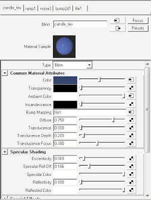
 In recreating the material for the candle I first noticed that its rim was a darker, solid blue. So I chose a ramp for the color node which is just a solid light blue to a darker blue, then back to light. The spotted texture was created by connecting noise to the ambient color. Next I added a subtle bump map to imitate the small scratches. Next I adjusted the eccentricity and specularity to match the photograph.
The Maya scene consists of three directional lights. One is the main light that emulates the Sun and is the only one that casts shadows. The other two are on the opposite side of the candle and only emit specular to the candle and only exist in the specular layer. This made it easier to control the highlights and imitate the reflection on that side by adjusting the color and intensity of the light. The lights are not pure white; they have a slightly yellow hue.
The occlusion layer is very subtle because if the direct sunlight. I adjusted the behavior of this layer by lowering the 'spread' attribute in the 'mib_amb_occlusion' node in the surface shader.
Compositing
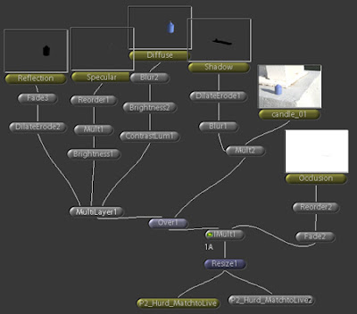
 A good majority of the project was done in Shake. Since I rendered in layers it was much easier to adjust parts of the image individually. The main parts that were adjusted were the blur and color of the shadow and the brightness and contrast of the diffuse layer.


